

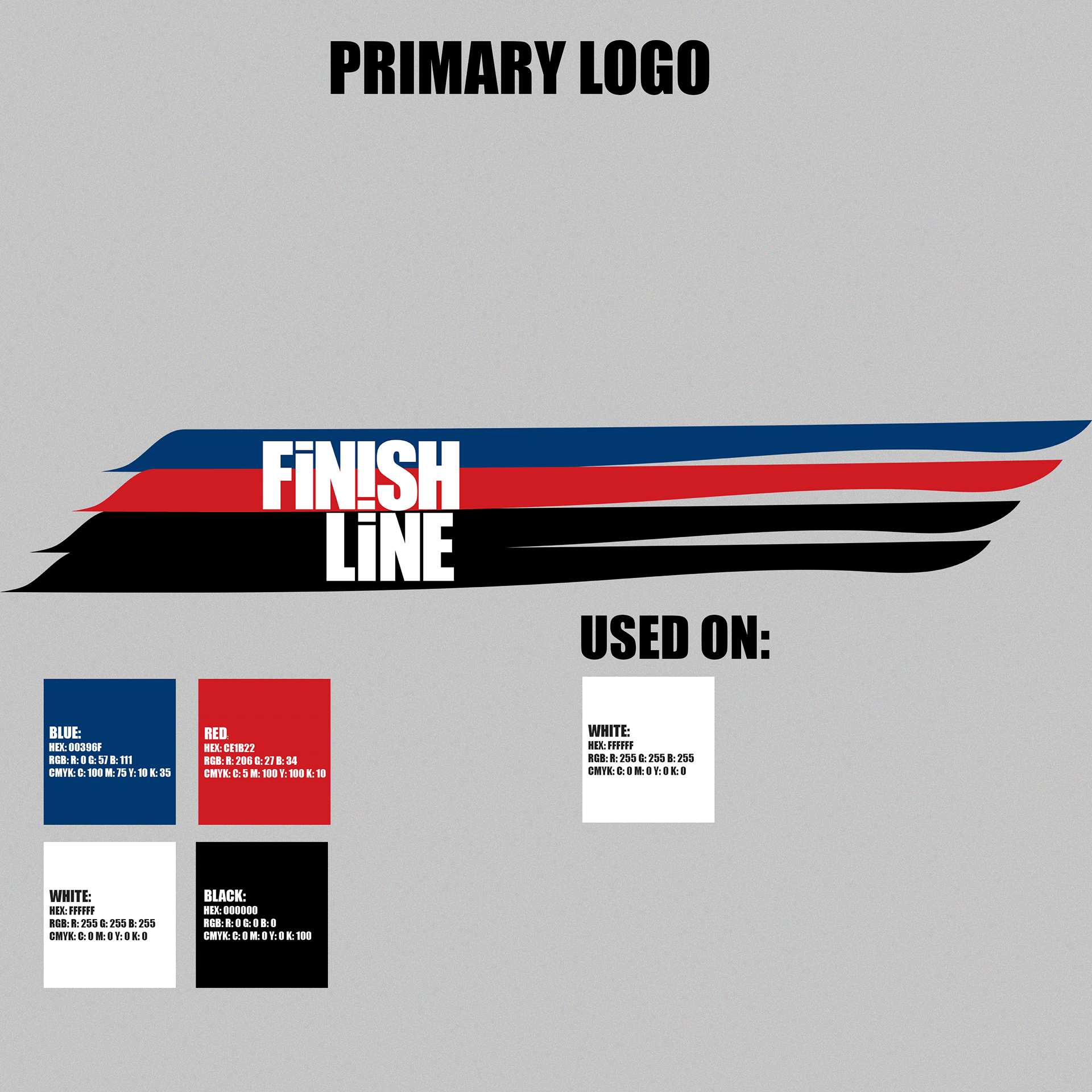
Logo and Brand Identity
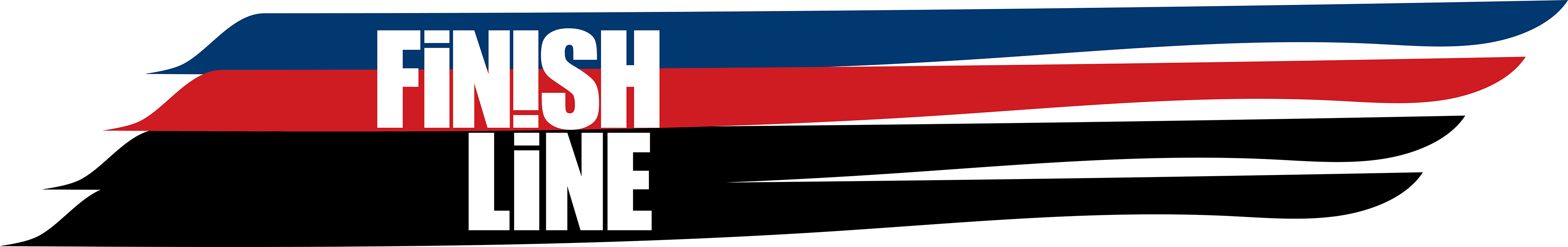
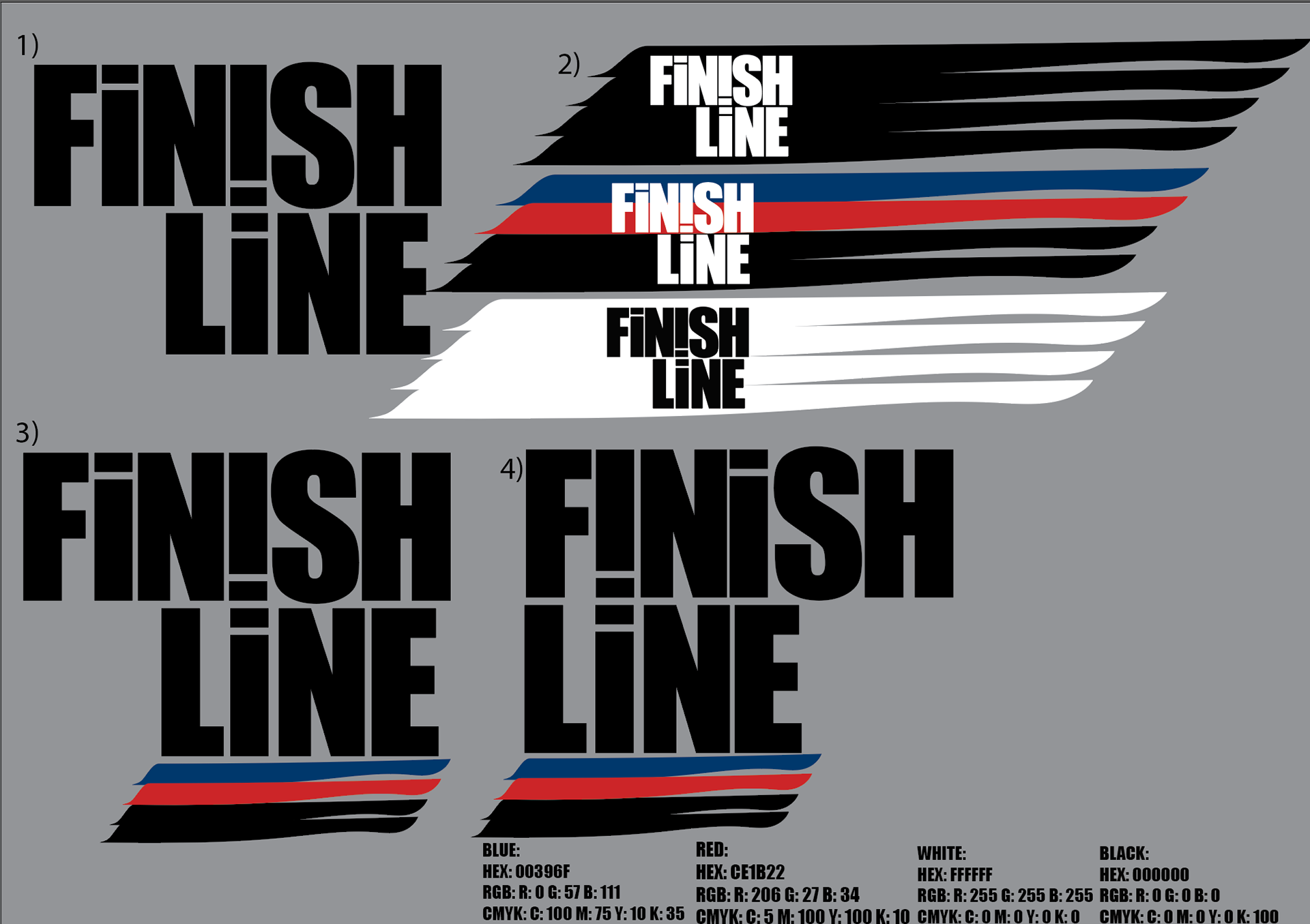
As showcased within the initial ideas the aim was to capitalise on the two 'i's to signify a running track. The name of the agency 'Finish Line' was placed on two lines to make the mark as readable as possible. With the scenario based around GB athletes I utilised shades of blue, red and white with black being used to distinguish between GB and other world athletes.
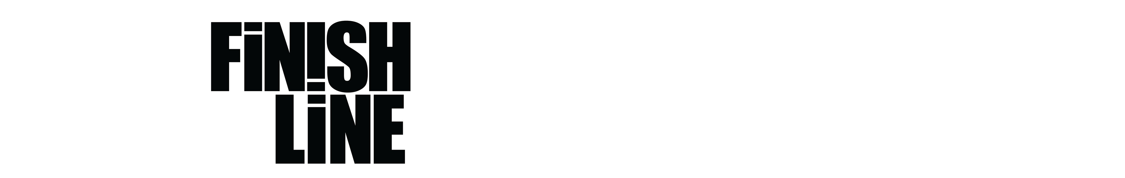
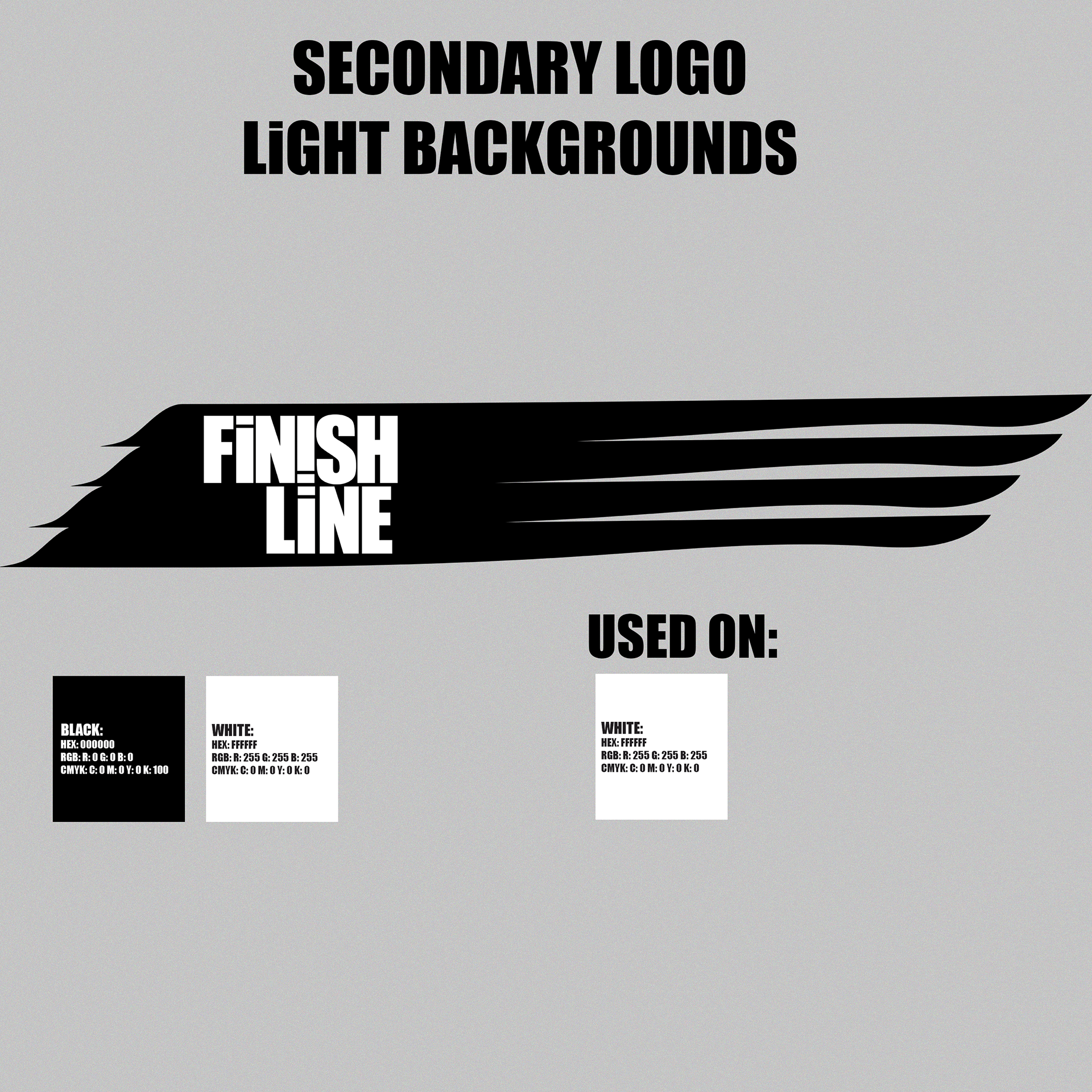
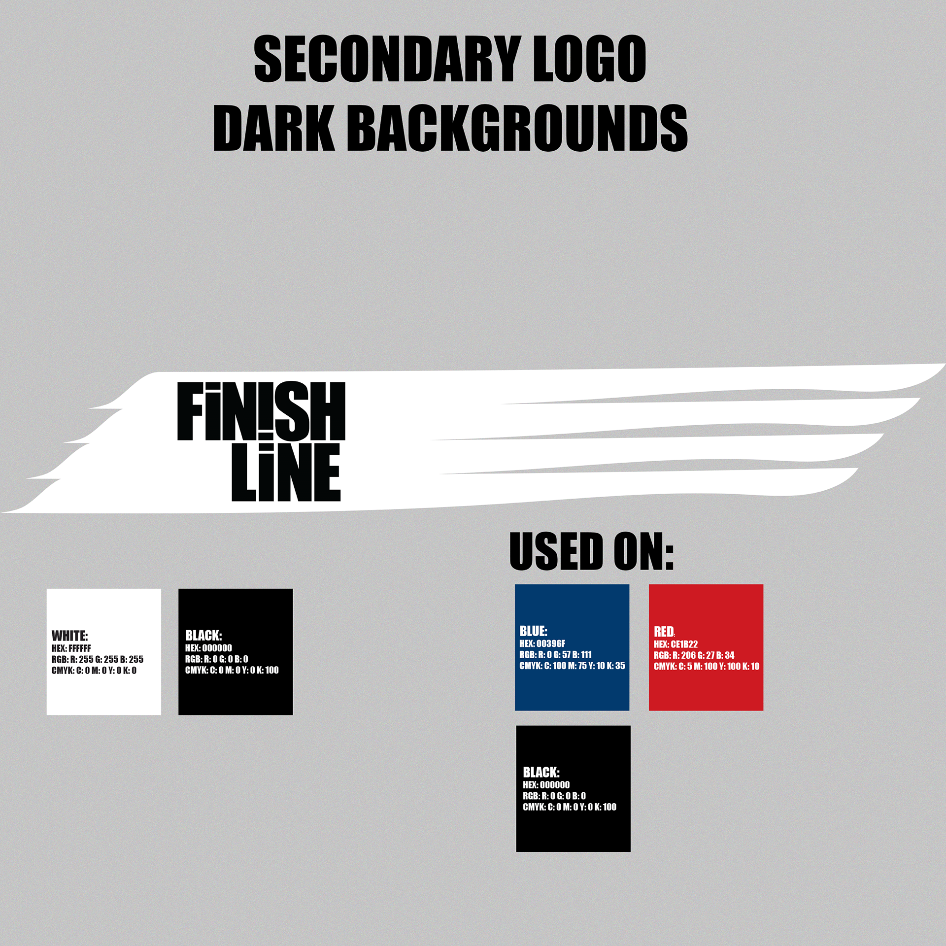
To create a unique look across brand, marketing and social media content I produced two further secondary logos, one black and white, the other white and black. This would make it easier when working across light and dark backgrounds making it easier to understand fir both viewers of the content as well as the designers creating the content.
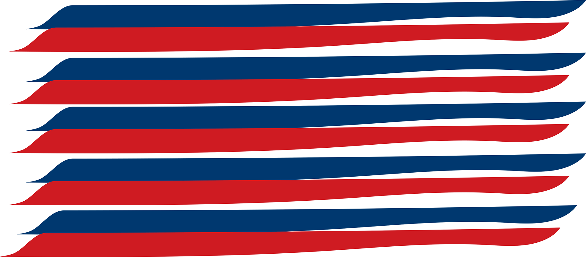
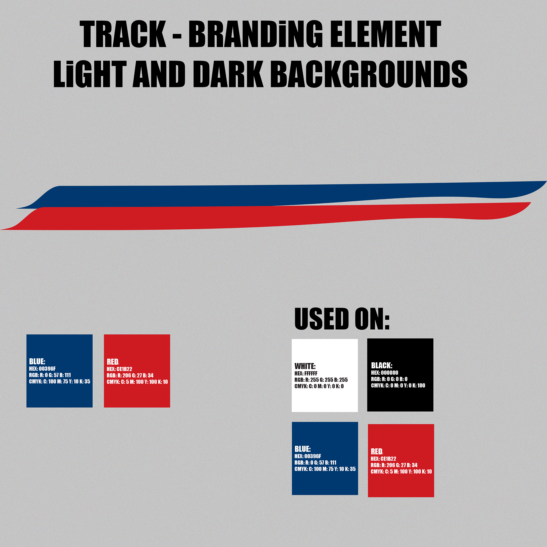
Additionally I created a track branding element to use across both light and dark backgrounds within creative content, this can also be stacked in use within backgrounds.
Initial Ideas
The initial ideas for the logo was to capitalise on the two 'i's within the name 'Finish Line' to show a running track.
The start of the logo signifies the starting blocks athletes stand on before a race.
The Vision and Mission of the concept agency was as follows:
Vision - 'To inspire the next generation to use sport to jump over life’s hurdles'.
Mission - 'Grow audiences and target objectives using collaborative creativity to generate captivating content and campaigns'.